Juttu

Juttu

Meir 19, 2000 Antwerpen
Description

[The Retail Design Lab has written this case study based on an extensive analysis of (and in consultation with) the retailer using our tools and scientific insights. This case study is intended to be an instructive 'best case'].

Juttu is located in an old building on the Antwerp Meir that has been restored to its original state. Juttu is a subsidiary of the AS Adventure group but is also a Finnish word that means 'anecdote', 'story' or 'story'. It refers to the personal and direct contact that Juttu wants to radiate to his client. 

The target audience are both men and women, the over 35s who are fashion conscious, have a positive attitude, a sense of style, are open-minded and are very aware of the story behind a product. The store wants to radiate a welcome feeling, where customers can take their time to consciously choose for quality. Furthermore, brand values such as open-minded, an eye for beauty, attaching importance to authenticity and slow shopping are central. Juttu works with different corners in which fashion, home, beauty and food products are sold.

Each 'corner' has its own specific presentation furniture that serves as an eye-catcher. A brand is always highlighted on this piece of furniture. This is also the place where storytelling is done to put the products forward in an attractive way. In addition, a series of basic furniture is used, always in a different type of wood and/or color per department. The furniture is modular so that many different configurations can be made. Storytelling, the attention to the story of the product, is the common thread throughout the store. Juttu is divided into five corners:

HIS = the man cave, for tough and strong men, norm core with a twist 

HER = her hotspot and therefore soft and feminine, playful and charming

ORIGIN = worldly and authentic (for him and her). 

AIR = natural and down-to-earth (for him and her) 

MAJESTIC = clean and chic (for him and her, upstairs) 

As you enter the store you enter the 'Origin' corner, a department that focuses on men on the right and women on the left. Here the senses are immediately stimulated by the scent, which was specially composed for Juttu, just like a second scent that is sprayed at the back of the store. For Juttu, scent plays an important role in the shopping experience and has been included in the design process from the very beginning. In this way, the scent could be professionally dispersed through the ventilation system. In the next department, the 'Her', a bathroom cabinet as presentation furniture is central where you can test care products. To distinguish this department even more, there are smaller decorative tiles on the floor. On the other side of the 'Her' corner there is still the 'Origin' for men. Behind it is the 'curated space', a pop up space where every eight weeks a new designer or start-up can indulge themselves with their own pop-up shop. There is also a countdown calendar in this space so that the customer knows how long the exhibited products/brands/artists are still available. This zone ends in the HIS corner. Here, rougher presentation furniture and tougher elements are used, such as a wall drawing made by an artist. Again storytelling is done by displaying the story behind the drawing and the artist. At the very back of the store is the 'Air' corner, with a striking moss wall as an eye-catcher. In the 'Air' a specific scent is atomized. A steel cabinet in the look of a conservatory is the eye-catcher here. 

Behind the curated space you can take the stairs to the top floor where you enter the chic men's section of the 'Majestic' corner. There is also an elevator so that this floor is accessible to everyone. Here are the authentic floors preserved. 

On the right side, a narrow corridor, in which the original mosaic floor was restored, leads to the fitting rooms. Here the customer can take a rest and settle down on a couch. A design rack with books was provided, all of which are also for sale.

When the customer rises above the left side, he ends up in the luxurious women's department of the 'Majestic' corner. Here, the authentic majestic staircase is the eye-catcher. Round tables and marble tops were also chosen here to radiate a little more luxury. Behind the ceiling-high curtains, made of Belgian linen, there is indirect lighting to create atmosphere.

After the women's department, the client arrives at 'Jummy', a space where you can buy trendy food and drinks such as granola's, chutneys, organic coffee and tea. Here, too, there is room to rest at the coffee bar. In the weekend there is a lot of experience here because there are also tastings on offer and you can have a coffee made by a barista. The coffee is offered to the customers as a service. This all fits within the slow shopping atmosphere.

Retailer story
The story of the Juttu merchandising and marketing team

By doing storytelling, through the shop window, through the Juttugram and through social media, the customer is informed, inspired and drawn into the story and the world of Juttu. Through a link between these different elements, the customer's experience can be strengthened and he can be inspired.

Juttu is still a young concept that many people who store at the Meir are not yet familiar with. In order to attract the proper attention of the many passers-by on the Meir and its surroundings, extra attention was therefore paid to the facade and the shop window.

We opted for a logo on the facade with indirect light. That light is very well thought out and when it gets darker outside, the framing of the logo comes into its own. The name 'Juttu' really stands out that way.

Bea De Beuckelaer, Buying & Merchandising manager

The display window always has a clear link with the Juttugram so that their communication is directly translated into an image, the display window. The magazine Juttugram also returns to various places in the store and when the new edition appears, it also gets a place in the middle of the store. The new edition is always presented to a paper clip with the text 'Take me home'.

The Juttugram serves as a source of inspiration: some people take it straight into the store and then walk around with the magazine, others take it home outdoors and some come into the store just to take the Juttugram with them. Our Juttugram is all about bringing stories, stories of products, brands, creators/designers and also the customers.

Lore Pieters, marketing manager

At the cash register there is always a reference to the Juttugram with matching hashtag. The letters of the hashtag are placed in a sliding system with interchangeable signs, making them adjustable when a new Juttugram is issued. These references each time bring a new story on the wall behind the cash register, which makes for a great experience.

Experience, that's what it's all about at Juttu; it's one of our hobbyhorses. We respond very carefully to all senses and we pay a lot of attention to visual merchandising.

Line Vanvoorden, Visual Merchandiser

In this way, the designer who presents his products in the 'curated space' is also consulted about the way in which the space is dressed up and filled up. There is always a search for a presentation that radiates the designer's personality, without disturbing the uniformity of the presentation with the rest of the store.

Everything must be geared to each other and form one whole: the online communication, the shop window, the Juttugram and the corners. Experience is responding to all senses and using them in a relevant way.

Bea De Beuckelaer, Buying & Merchandising manager

The idea in the store is that the total experience is for sale. The clothes, as well as the furniture and accessories, but also the plants are for sale. In the 'Air' section there is a tree that puts the hanging plants in the spotlight. The intention of 'Air' is to bring the garden back to the city. Air' is the green lung of the store.

As far as music genre is concerned, the choice was made not to loungy or relax all over the store, but also not too loud; an attempt was made to create a nice mix that fits the identity of Juttu. The right climate in the store also contributes to a good sensory experience. The ventilation system is provided to not only heat but also cool. This cooling is really necessary for two reasons: at the top of the large window it can be really unpleasant on hot days, which is not good for the food that is sold; in addition, the plants need a cool indoor climate. The ventilation system is also used to disperse the specially formulated fragrance. This scent is so popular with customers that the staff is often even asked if it is for sale in the store.

What was initially struggled with is luring customers upstairs. An attempt was made to make the stairs as attractive as possible by placing products on top of them to attract customers upstairs. It is only since the installation of the lightbox with 'signage' that a clearly measurable increase in the number of customers upstairs was observed. These lightboxes are fully in line with the principle that light functions as a guiding element throughout the store, which was devised together with Retail Office. In the rest of the store, loose pears give a lot of atmosphere and indicate the store path. 

Upstairs, at the fitting rooms, a slider system is used; a modular rack on which you can display extra items and thus focus on additional sales at the fitting rooms. On the mirrors in the fitting rooms there is always a reference to the Juttugram and customers are encouraged to take a selfie. Here, too, the hashtag is always displayed. This reference is simply written on the mirrors with a chalk marker and is therefore easy to adjust. The mirrors can rotate so the customer can see themselves from each side and are specially installed to provide extra fitting comfort. The 'yes', 'maybe', 'no' coat hooks also provide an extra experience in the fitting rooms.

By the way, this coat rack idea is a great success and is widely shared by customers on social media. Again, the green element comes back next to the homely and cosy feeling that this fitting room should radiate.

Line Vanvoorden, visual merchandiser

It is important to always respond to the needs of the customer and to play ball very briefly. For Juttu this is also an experience: responding to what the customer needs or expects at any time. At the entrance a presentation furniture is always provided on which fashion as well as home, beauty or food products are presented. These correspond perfectly with the story in the Juttugram or what is then put in the spotlight on the social media. The RAINS raincoats that you will find there on a rainy day, for example, are quickly exchanged for colorful swimsuits, sunscreen and trendy beach toys for a summer weekend. All facets of experience come together again here.

Audit
DIY fashion audit

When Bea completes the DIY Fashion store audit for Juttu she comes to the following result.

Type: Guggenheim

The store plays on the senses very strongly and uses this more than just creating atmosphere. Music, scent, choice of materials, visuals, etc. are part of the story the store wants to tell. This triggers an emotional interaction with the customer; he becomes strongly involved in the story. Both the store design and the product presentation (VM) are taken care of. Space and product are seen as equally important for conveying the story. The more the cross is placed towards the outside of the figure, the more intensely the store responds to the senses and the more important product presentation and seduction are central to the experience of the store.

We typically see this type of store in the higher to luxury segment of the market.

Elk type gaat gepaard met mogelijke valkuilen

A possible pitfall with this type of store is that the consumer gets a feeling of alienation through overstimulation. If we get too many or too intense stimuli, we distance ourselves from that which gives us too many stimuli, with the possible result that the customer simply goes outside. Make sure that the senses are subtly stimulated, like a silent seducer.

Experience matrix

Although the sense matrix is a design tool, here we use it as an evaluation tool to illustrate the use of the matrix.

In the top row are the 4 brand values of Juttu, followed by their type of product and the type of premises they occupy. The table shows what Juttu has bet on: which brand value has received which sensory translation. This tool can therefore be used during the design process to translate what the store stands for into a suitable store design.

matrix
+ & - points

When we test Juttu against findings from research and literature, we arrive at a list with on the one hand very strong points in terms of shopping experience and on the other hand a few points of improvement that are necessary to further increase the experience in the store and to consistently convey the story that Juttu wants to tell.

Strengths

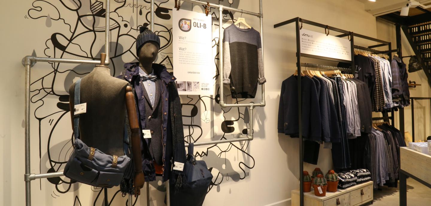
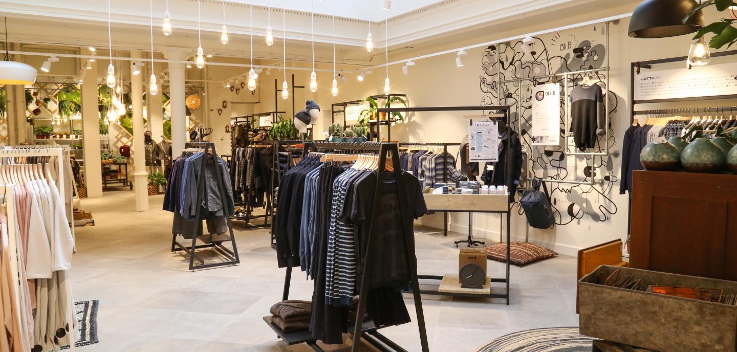
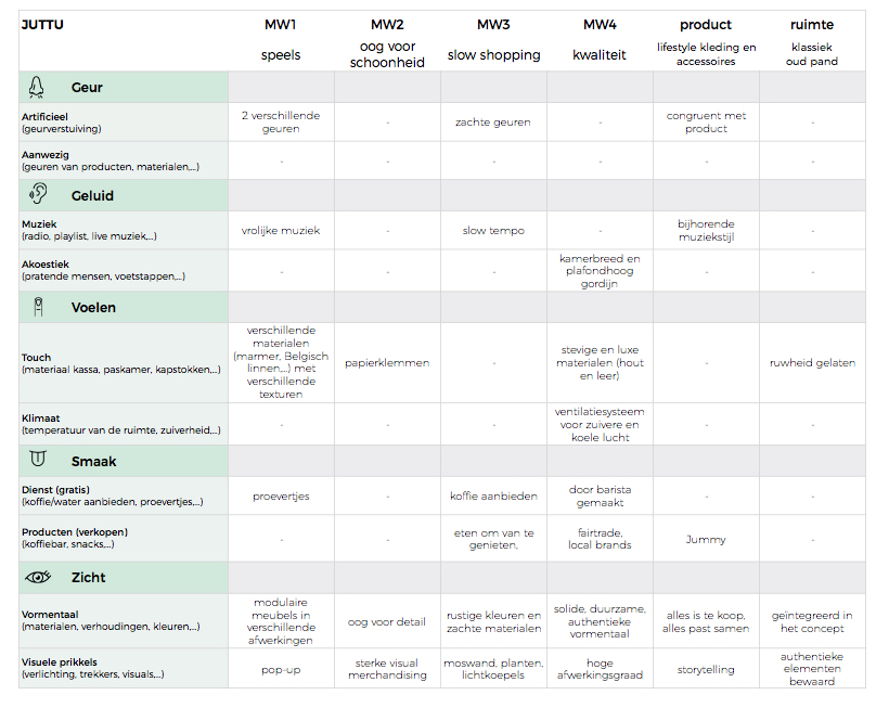
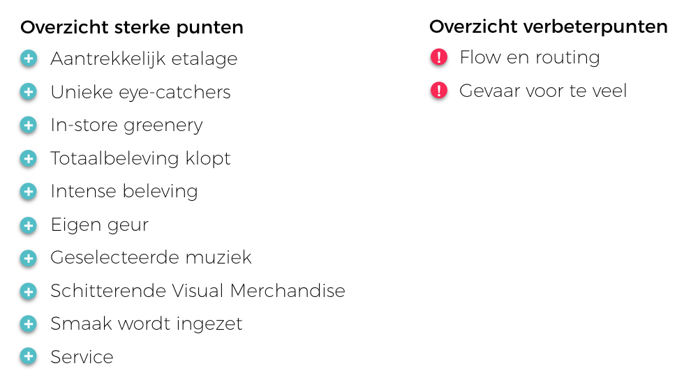
ETALAGE - The store windows communicate the style of the Juttu story: the consumer immediately sees a varied range of products and the attractiveness with which the products are displayed makes the consumer want to discover the store (Oh & Petrie, 2012). The store windows have 'stopping power' which allows the consumer to take the time to look and enter. The products are presented in an original but relevant way. The images, posters, the Juttugram and the references to the designers fully fit the concept (Lange, Rosengren, & Blom, 2016) and are deliberately and thoughtfully placed. This display window makes the consumer curious and responds to the shopping experience by radiating a playfulness and by bringing refinement (Kennedy & Parsons, 2015).

EYECATCHERS - eye-catchers attract attention and ensure that the consumer is led through the store (Chan & Chan, 2007). 

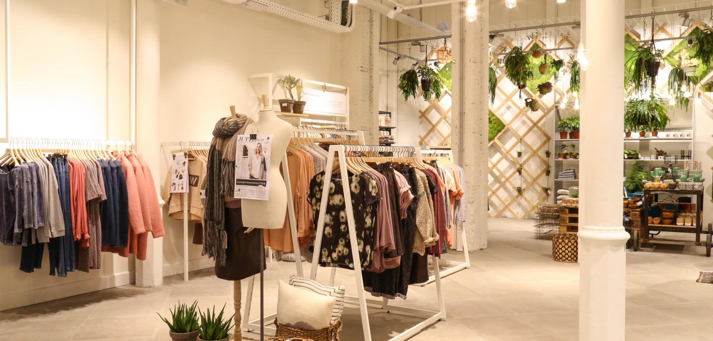
GREEN POLICY - The moss wall at the back of the store is a real eye-catcher and provides a resting point in the store. In a complex (store) environment (i.e. an environment where a lot is happening, there is a lot to discover, with a varied range of products and a stimulating design) the customer gets a lot of information to process. The integration of green elements and natural materials such as wood in the space where the customer gets many stimuli, provides a stronger sense of well-being and also has a stress-reducing effect (Brengman, Willems, & Joye, 2012). These positive feelings, in turn, ensure that the client may be more open to the environment and will show a faster approach behavior than when he is in the complex space without rest (such as green elements).

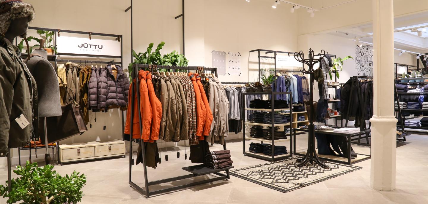
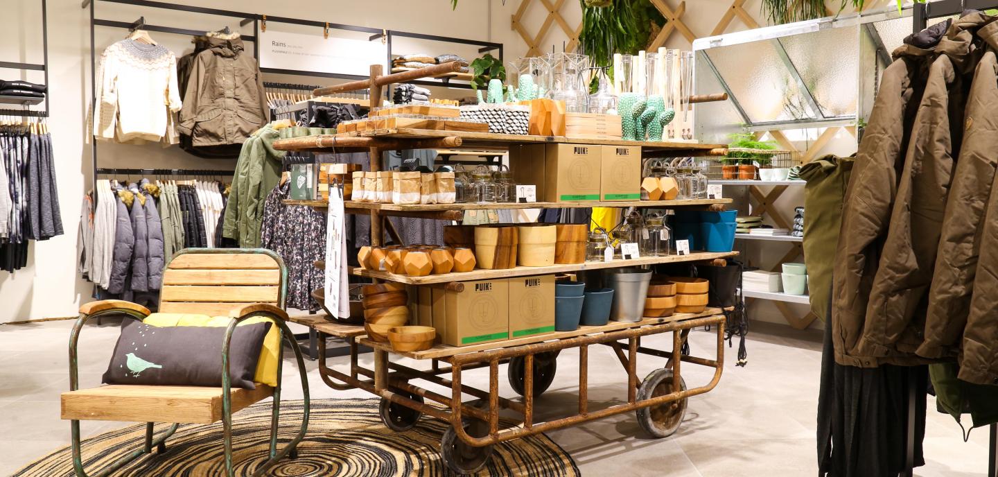
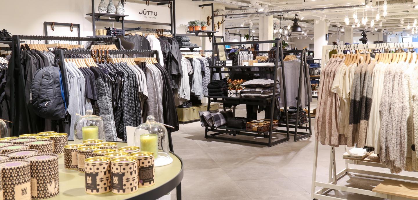
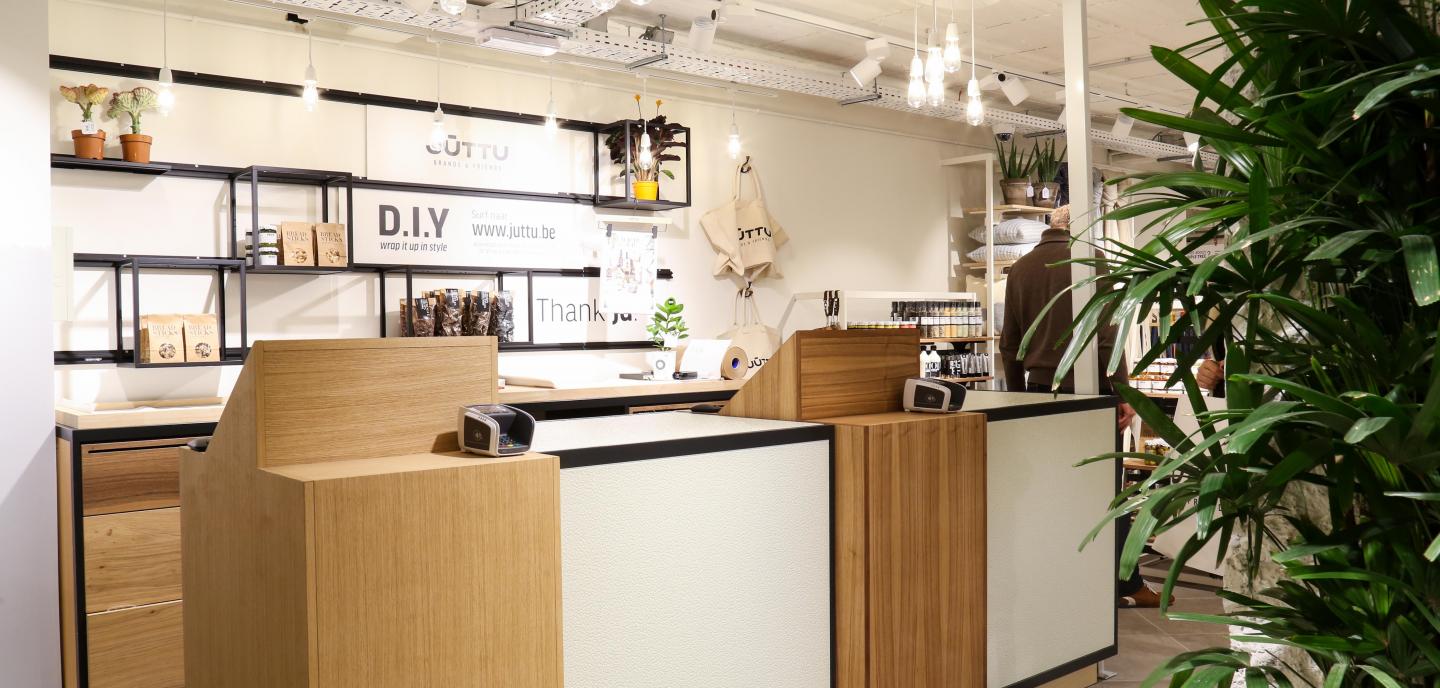
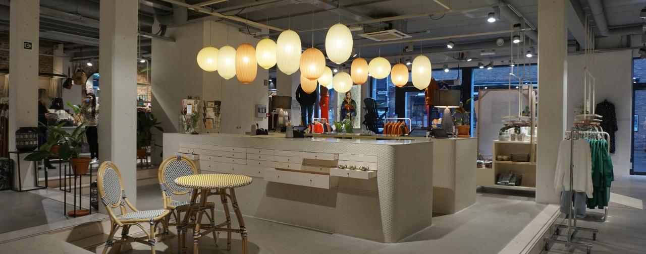
TOTAL POLICY - The colors used (shades of white and green) for the walls, ceilings and walls are completely in keeping with Juttu's visual identity (Labrecque & Milne, 2012) and radiate calm and naturalness. Because both the ceilings below and the walls are painted in white tones, it gives the building an even more spacious look and provides breathing space (Oberfeld, Hecht, & Gamer, 2010). The natural daylight that enters through the dome at the back of the store emphasizes the open, spacious feeling. At Juttu, the lighting is clearly used as an extra atmospheric feature (Custers, Ijsselsteijn, de Kruiff, 2010) and does not merely serve to illuminate the products. The choice of materials for the presentation furniture is in line with the atmosphere and cosiness that Juttu wants to radiate. Several pieces of furniture were left rough and furniture in weathered wood was also used, which is perceived as warmer than if materials with a smooth surface had been chosen (Wastiels, Schifferstein, Heylighen, & Wouters, 2012).

By appealing to each of the senses in a well-considered way and doing so in a dosed way, the shopping experience is more intense and strengthens the brand and the Juttu story (Schifferstein, 2011). 

Scent - In order to enhance the different atmospheres in the store, a specially developed fragrance (Klara, 2012) is spread in three places. When a scent is congruent with the products sold or goes hand in hand with the atmosphere of the store, customers will evaluate both the products and the store more positively (Spangenberg, Sprott, Grohmann, & Tracy, 2006). When scents are perceived as warm by customers, this can also lead to a higher buying intention and ultimately increased buying behavior (Madzharov, Block, & Morrin, 2015).

MUSIC - Juttu uses a self-composed playlist so that the music style also fits within the picture: soft, easy listening music at a pleasant volume that positively enhances the atmosphere (Morin, Dubé, & Chebat, 2007).

VISUAL MERCHANDISE - This is used efficiently and effectively as a means of communication and thus increases the positive evaluation of not only the products but the entire store (Cavazza & Gabrielli, 2014).

SMAAK - The tastings contribute to a pleasant shopping experience and contribute to sales (Biswas, Labrecque, Lehmann, & Markos, 2014).

SERVICE - Juttu starts from a customer-focused approach and that bears fruit (Hwang & Chi, 2005). The personal touch of the staff on entering the store already indicates that the visitor is welcome and can quietly explore the store at their own pace. The staff has a proactive attitude, without being intrusive, and in several places in the store the visitor can be helped, if desired. The sincere friendliness, helpfulness and product knowledge of the staff make the consumer feel safe and have a positive shopping experience (Kulkarni, 2013).

Improvements

FLOW & ROUTING - To search for a particular product and/or department (e.g. the fitting rooms), customers orient themselves to the space around them (Titus & Everett, 1996). They search for textual or visual indications and scan the space until they find a point of recognition and can orient themselves further on that point. When men on the ground floor find texts on the walls that refer to even more clothing on the floor, they actually expect to find men's clothes there (which was not the case at the time of the study). Lack of clarity about the product range disrupts the smoothness or natural flow of the consumer through the store (Otterbring, Wästlund, & Gustafsson, 2016) and can cause him to stop the search attempt. Consumers who feel they can move around the store easily and in a kind of natural flow are positively influenced in their decision making process (e.g. Schwarz, 2004) and are also more inclined to give in to unplanned purchases (Inman, Winer, & Ferraro, 2009). Especially for people visiting the store for the first time, it is important that they are able to orientate themselves and find departments, brands and product offerings with a certain ease. Clear communication and signage are therefore crucial elements of a pleasant shopping experience (Newman, Dennis, Wright, & King, 2010).

DANGER FOR TRANSPORT - It is one of the strengths of Juttu that it appeals to all the senses to provide consumers with a pleasant shopping experience. It is precisely here that the danger of over-stimulating and exposing the consumer to too much information, too much text, references, too strong smell, too many products,... In order to create an overall experience, it is not a question of opening up all registers and using as many stimuli as possible. It's about finding the right balance and using stimuli in the right proportion, fitting and congruent with the concept the retailer wants to create.

+ en -

read our other case studies