Veritas

Veritas

Wolvengracht 14-16, 1000 Brussel
Description

[The Retail Design Lab has written this case study based on an extensive analysis of (and in consultation with) the retailer using our tools and scientific insights. This case study is intended to be an instructive 'best case'].

The Wolvengracht branch is located in a beautiful old building in a side street of the rue Neuve in Brussels. This store combines the old elements of the building (original facade, brick walls, high ceilings) with a homely and creative atmosphere which creates a special interplay and is very inspiring. This branch is one of the first Veritas stores where the completely new concept 'Atelier Veritas' was rolled out.

Two atmospheres can be distinguished in the branch: downstairs, softer shades and refined wooden furniture were chosen to emphasize the calm and to evoke a relaxed feeling. Upstairs, we chose to focus on the creative aspect with rougher furniture, rough brick walls and a looser way of product presentation. The openness of the branch and the feeling of spaciousness are supported by the natural light that enters through the large windows on the ground floor as well as through the windows on the first floor. The conviviality is created by the black ceiling, the high density of the many colorful products, the hanging lamps that hang above the cash registers and the creat table and hanging plants that return in a few places both above and below.

When you enter this branch, you first come to the accessories. This is also very clearly indicated by an inspiration table that you immediately look at. This also works as a stop factor when entering. The table is also on a different floor, consisting of retro tiles that emphasize the zone even more.

In the back part of the store you will find the leg fashion. The eye-catchers here are the wooden legs that playfully indicate the department but which also hang as an example on the heads of the legwear racks. This is an original typical Veritas way of showing legwear. Between the legwear and the accessories department, about half of the store, is the cash register, with the stairs facing up. The cash register is completely made of wood and is ergonomically pleasant to stand on. Around the cash register the smaller accessories such as jewelry and hair fashion have been given a place. In the old concept the jewels were presented on the walls in racks, but in the new concept they hang in merry-go-rounds/towers by color and style. Where the customer used to be unable to see the trees through the woods, he can now determine at a glance where he can find what he wants. Hair fashion was also more clearly organized into new furniture.

The stairs and elevator are in an elegant white cage made of drawn steel plates. In this way, the stairs really get a place and the stairwell is conveniently used to display creations.

On the top floor one can find Atelier Veritas. Here you will find all the products to make it yourself, from pearls to fabrics, buttons, yarn, sewing materials, etc. as well as the creation table where workshops can be given. Where below the indication of the departments was done through colored panels with a creative name for the products (such as fan-tas-tic with the handbags), here felt panels are used where the products have been used in a creative way so that the whole is very playful and can change every time. The eye-catchers on this floor are definitely the pearl table with the fabric wall behind it, and the wool wall. The nicest place of this store is the creation table that bathes in daylight and is surrounded by nice furniture with all kinds of small sewing supplies and magazines.

At the very back of the store you can find underwear and nightwear accompanied by a fitting room. This department is a little bit in the back so you get an intimate and private atmosphere. Also on the upper floor there is a cash register that is easily integrated in the shape of the white staircase.

Retailer story
The story of the merchandising and marketing team

With Atelier Veritas a real concept store has emerged where it all revolves around DIY. The brand Atelier Veritas focuses specifically on the whole DIY story of Veritas. With this brand Veritas wants to focus even more on the creative and offer more than just the products. That's why workshops are organized during the day under the guidance of crea-experts. Clients can come together to get creative, each time within a specific theme. Everyone can come to the 'crealab' - from absolute beginner to true expert - to learn new techniques, get inspired and discover new DIY trends. Veritas works with an extensive collection of fabrics and wool, and professional machines are available. Everyone who participates can also continue with his own creative work: knitting, crochet, sewing, jewelry making... everyone does his thing and can ask for help and advice if desired.

We actually want to respond even more to the needs of our customers. Some want to work with one of our crea-experts to find a first success in the whole DIY thing while more experienced hobbyists don't need to follow a pattern from one of our inspiration magazines but just want to start a new project themselves. We then ensure in the crealabs that material and machines are available and that everyone can go their own way.

Kristel Peeters, Product & Visual Merchandising Director

With Atelier Veritas the experience is brought to the store, but there is also an online Atelier hatch so it's a real omni-channel story.

We want to fine-tune the communication channels that we are all already playing, so that we can convey an even more /straighter experience and inspire our customers even better.

Kristel Peeters, Product & Visual Merchandising Director

There are very few stores that offer as many aspects of the creative as Veritas and we also want to continue to respond to the trends within the creative world. We have a project group that meets regularly to discuss how we can bring the creative experience to our customers even better.

Frank Devree, Visual Merchandising Coordinator

It's about giving people the desire to get to work themselves. Examples hanging in the store and the good advice of the sales staff stimulate the confidence to be able to make something themselves. During the weekend regular demos are given to inspire (new) customers and show what you can make with the products that are sold. These demos also provide extra experience: customers are used as experience experts and knit live in front of the entrance of a branch or in the shop windows.

At each renewed store and at each newly opened store, the current concept is refined and adjusted where necessary based on advancing insights and experiences. For example, based on experience, it was decided to move away from the wool wall in honeycomb model, one of the typical eye-catchers, and to replace it with a tighter wall with compartments for practical benefits. More wool can be presented and stocked and it is also visually clearer to present wool types. This honeycomb wool wall will therefore no longer be installed in new stores or in stores that will be renovated.

This branch has two shop windows, left and right of the entrance. Where the old concept was still working with panels in the store windows, they are now see-through; there are posters on suspension systems, but enough space is left so that passers-by can have a look from the back of the store. The decoration of the store window is kept quite sober by working with side tables (podiums) at different heights to display products. These tables can be used very flexibly so that a different look can be created every time.

We also always make sure that the products that are new at that time are at the very front of the corresponding department so that they immediately catch the eye. By placing products folded as much as possible on tables and racks instead of hanging them on coat racks, the customer can better handle the products and will pick them up faster.

Kristel Peeters, Product & Visual Merchandising Director

At every presentation a 'welcome feeling' is kept in mind and applied as much as possible. Promos are therefore always placed on the head of a piece of furniture; the customer immediately sees that there is an action. The presentation furniture is made of wood and white metal, with variations per piece of furniture. The sober, simple that the concept wants to radiate, is reflected in the furniture. The wood evokes a warm, homely and cozy atmosphere while the white metal looks fresh, austere and sober.

To draw attention to the latest products, a green sphere was developed (the green of the logo) which can then be placed with these products. In this way, the new, monthly themes are brought to the attention in a clear and playful, creative way. Every month, new goods are sent to the stores to keep surprising the customer and to meet their needs and to respond to the seasons. The collections must remain sufficiently exciting and therefore continuously innovate.

Frank Devree, Visual Merchandising Coordinator
Audit
DIY audit Veritas

If you fill in the DIY Fashion store audit for Veritas, you get the following result:

Type: MAS

In this store, the space (architecture of the building and the store design) is equal to the product range. These two elements support each other in the retailer's story, but one is not more important than the other. Senses are stimulated, but this happens rather subtly, like a quieter seducer. The store is balanced and inviting both in terms of form and content, making the threshold very low. The customer can browse as well as do targeted shopping.

Each type is accompanied by possible pitfalls

A possible pitfall with this type of store is that little news happens, it's a store like there are 13 in a dozen. The middle field in the figure is the image where the majority of fashion retailers are entering. Creating a more specific and personal experience can differentiate your store from and give it an edge over the rest of the market.

Experience matrix

Although the sense matrix is a design tool, here we use it as an evaluation tool to illustrate the use of the matrix.

In the top row are the 4 brand values of Veritas, followed by their type of product and the type of premises they are in. The table shows what Veritas has bet on: which brand value has received which sensory translation. This tool can therefore be used during the design process to translate what the store stands for into a suitable store design.

Zintuigenmatrix Veritas
+ & - points

When we test Veritas against findings from research and literature, we arrive at a list of very strong points in terms of shopping experience on the one hand, and on the other hand, a few points of improvement that are necessary to further enhance the experience in the store and to consistently convey the story Veritas wants to tell.

Strengths

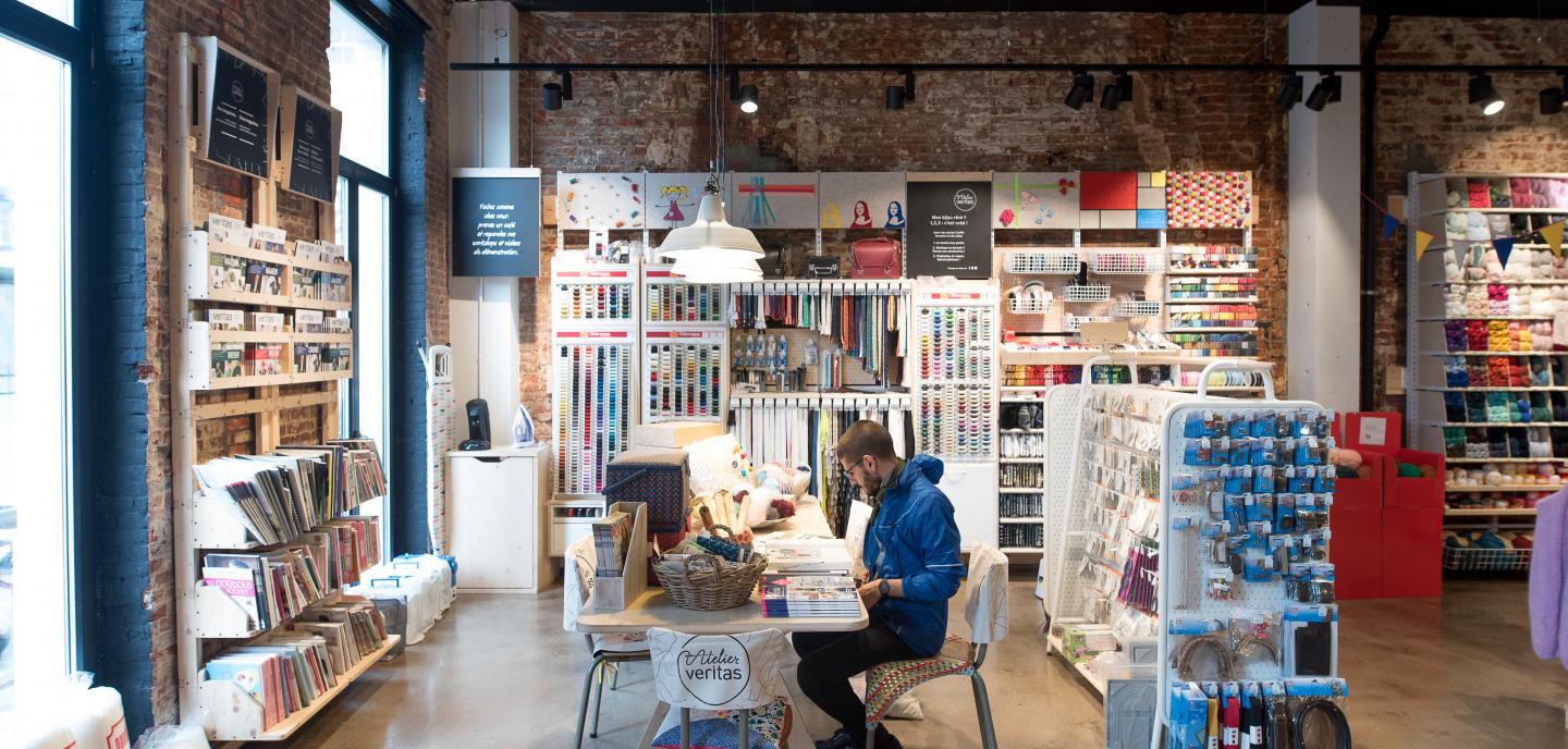
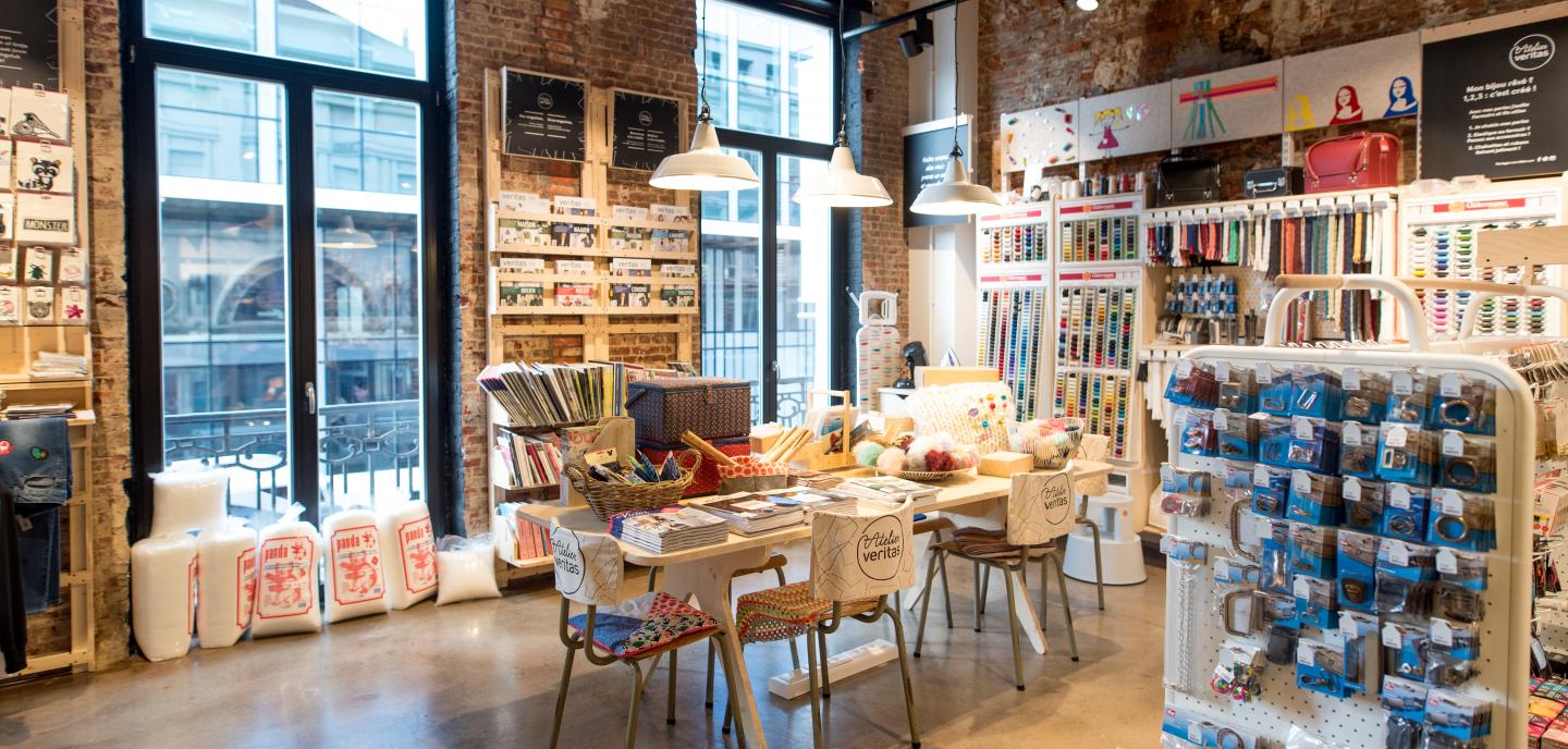
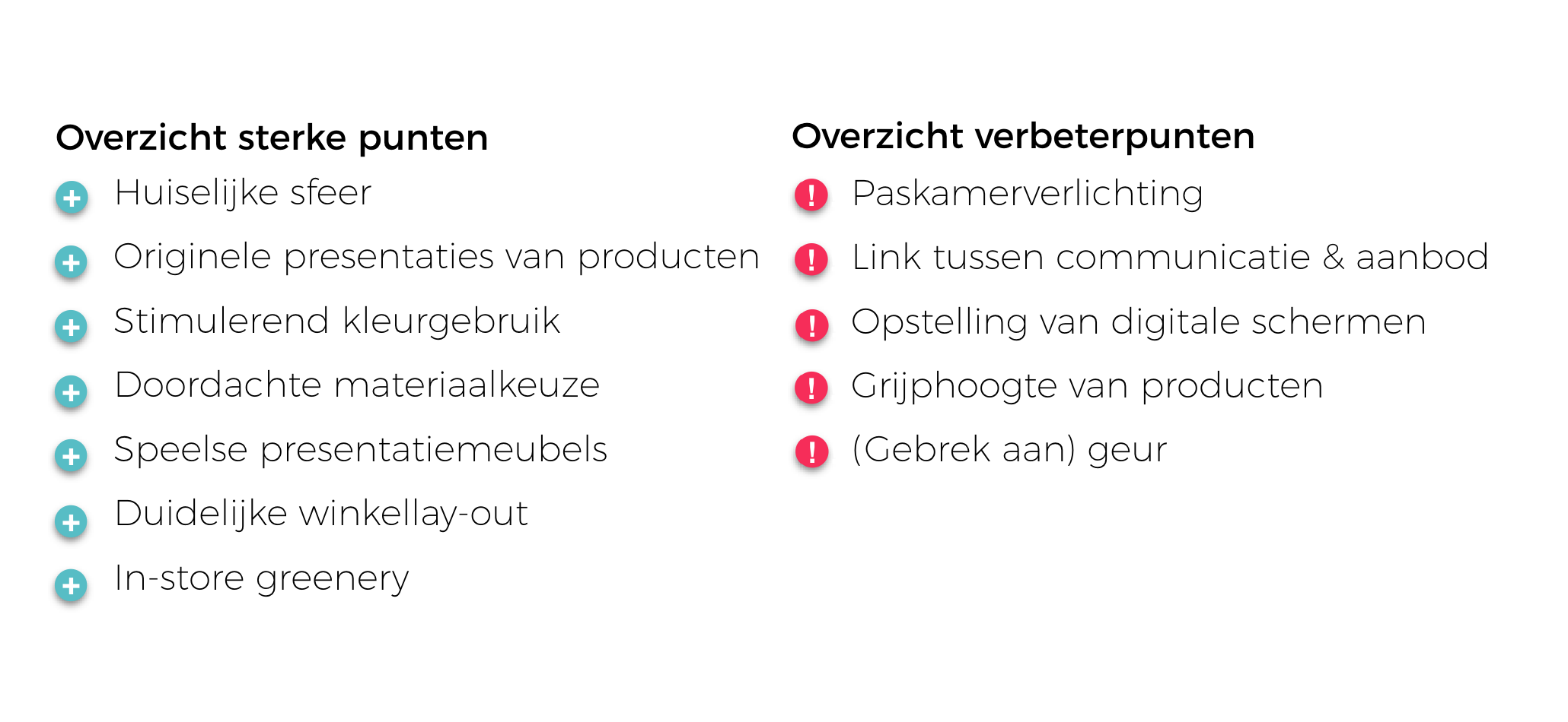
SFEER - the retro tiles and the grey-brown concrete floor radiate warmth which enhances the homely atmosphere and cosiness that Veritas aims for (Pine & Gilmore, 1998). The austere white metal shelving and the white metal staircase cage emphasize the modern and, in combination with the wooden presentation furniture, provide a pleasant alternation and contemporary touch. The crealab on the first floor and the original presentation of the DIY material highlight Veritas' creative element and playfulness (Kent, 2007).

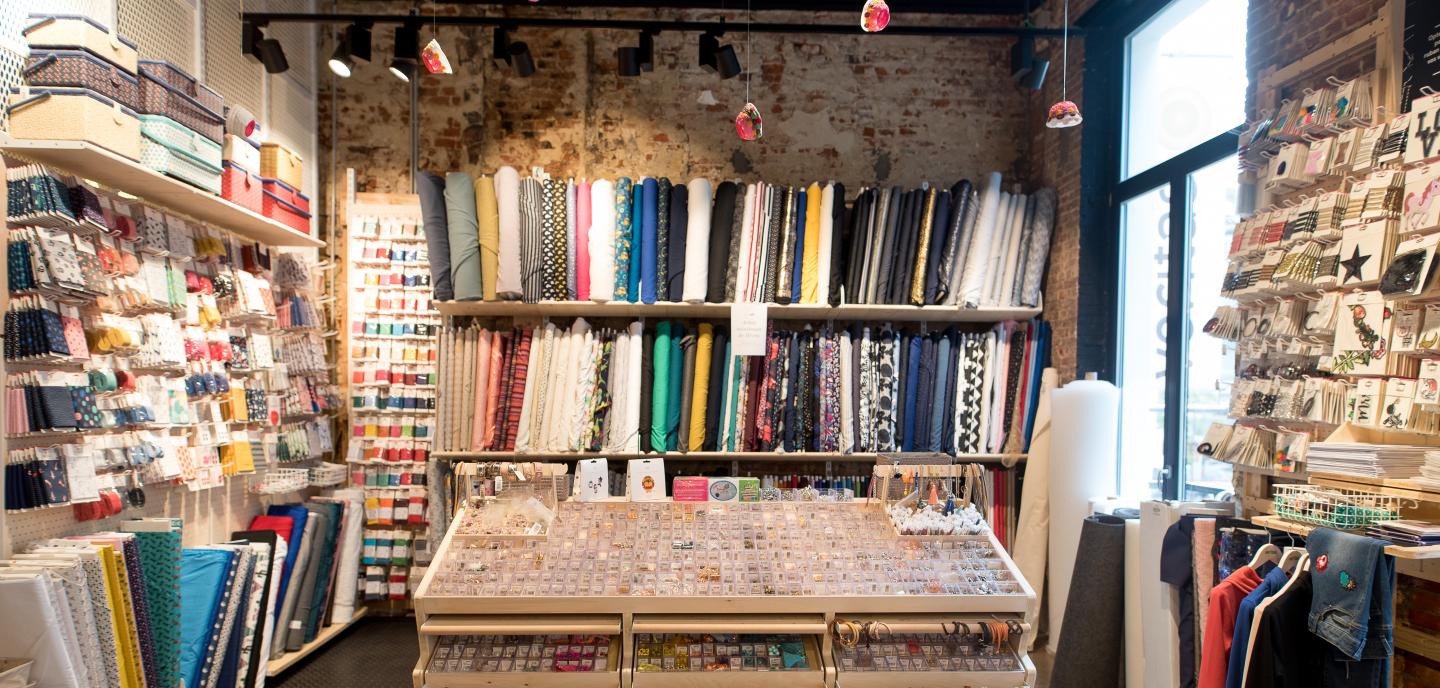
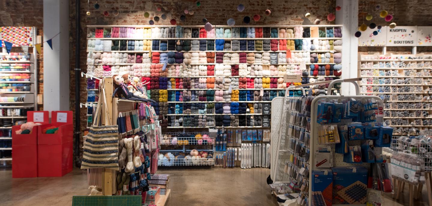
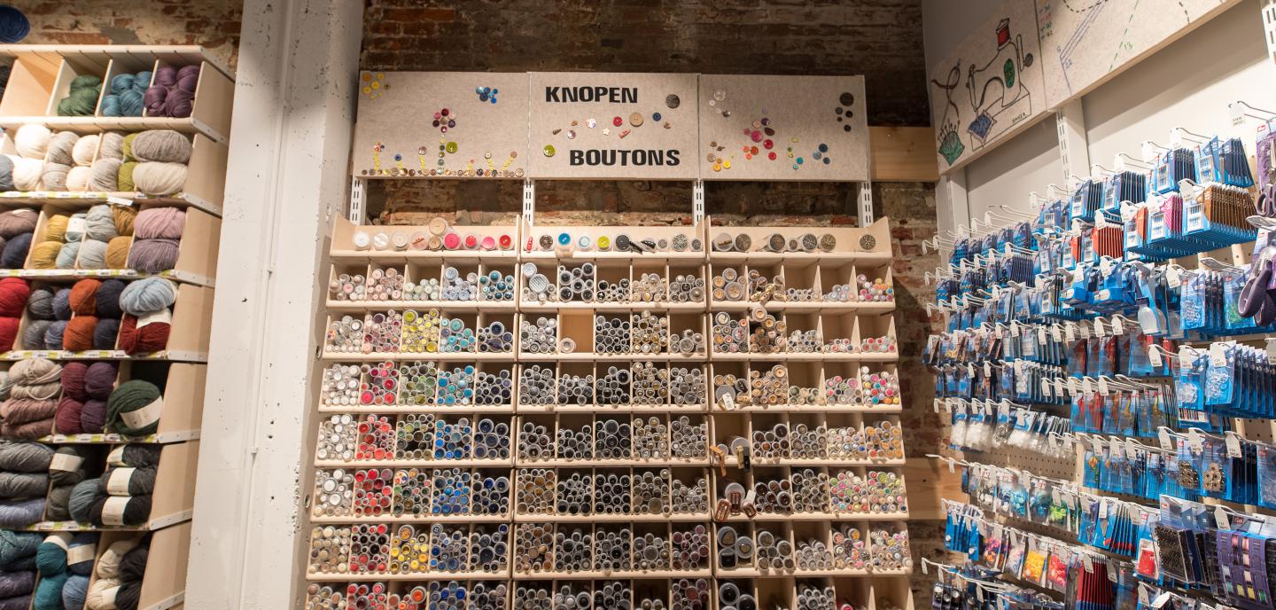
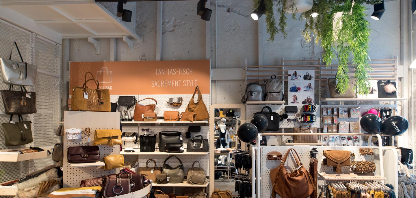
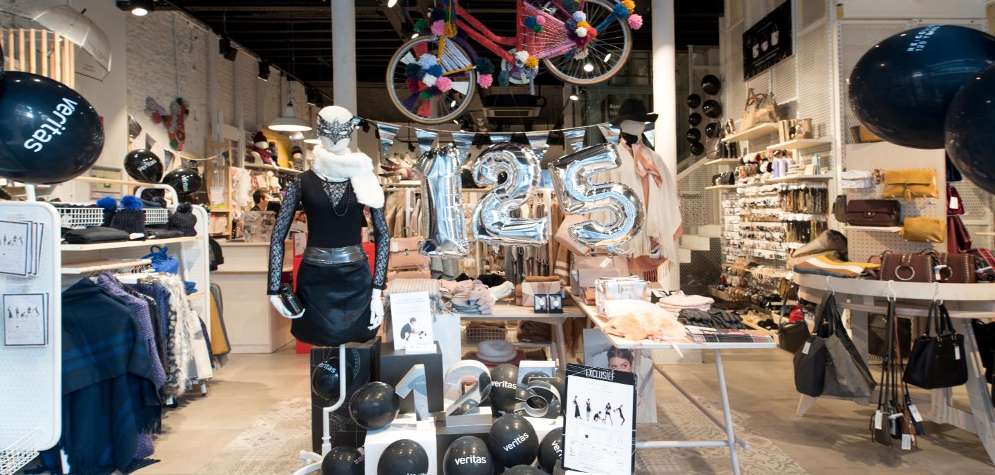
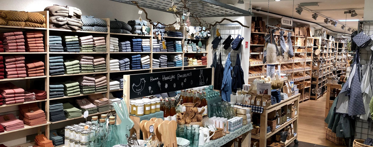
EYECATCHERS - a number of presentation furniture stand out and are not only functional but also real eye-catchers. The wall to present the wool is impressive because of its size, the shelf with fabrics allows a vertical presentation of the fabrics and looks original and attractive, the furniture with the pearls invites to try, and the DIY workshop space upstairs acts as a real hotspot (Quix & van der Kind, 2012).

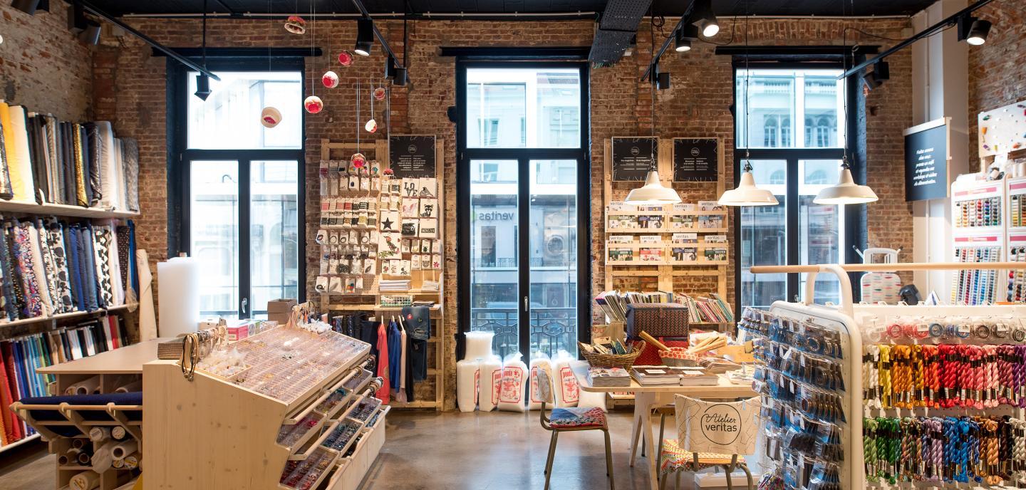
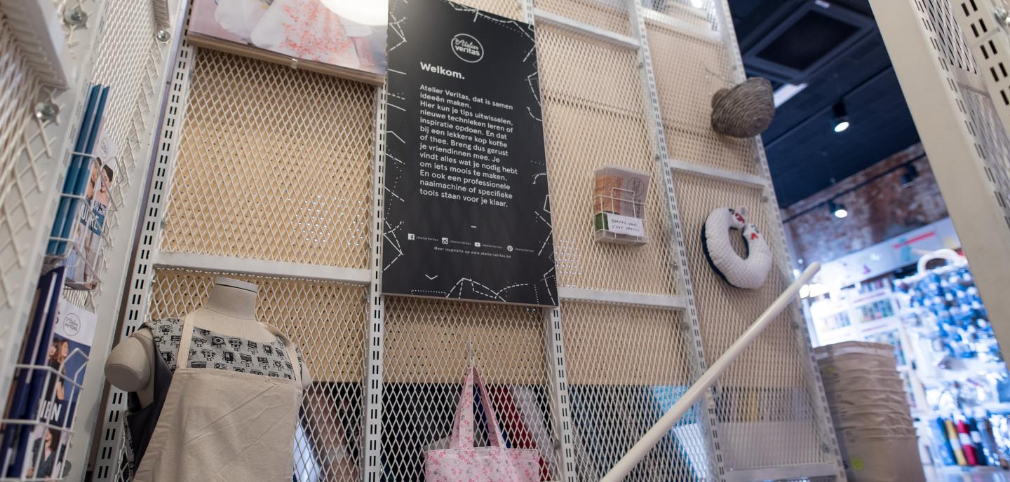
COLOUR USE - the original old brick walls are left rough and emphasize the DIY aspect. Downstairs the bricks are painted white, upstairs they are left exposed. A black ceiling has been chosen to make the large room more compact optically (Oberfeld, Hecht, & Gamer, 2010) and to bring out the cozy lake. Light colors predominate on the ground floor; colors that are universally associated with tranquility and softness (Chebat & Morrin, 2006). The white elements that are also strongly present in the branch bring out the explorative in the customer and stimulate him to explore the shopping environment (Brengman & Geuens, 2004).

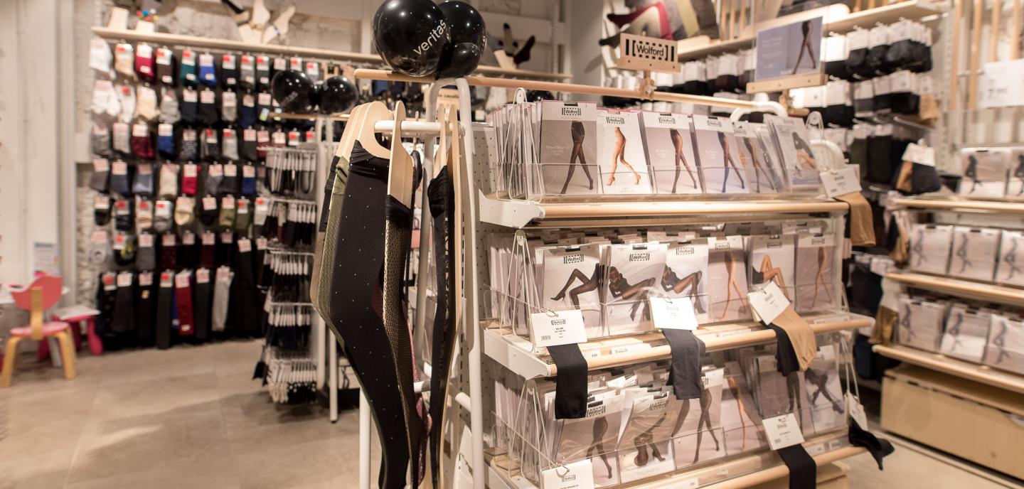
MATERIALS - Light wood presentation furniture and white metal shelving were the main materials used. The wood contributes to the homely atmosphere that Veritas wants to convey: the use of real wood is still associated and evaluated as warmer and cozier than a material in wood look or than the use of laminate (Jimenéz et al., 2016). The shopping baskets are thoughtfully covered with linen to respond to the soft and cosy. The touch of a soft, fabric shopping basket evokes more positive feelings about an environment with the customer than the touch of cold, hard plastic (Wastiels, Schifferstein, Wouters, & Heylighen, 2013).

PRESENTATIONEUBELS - the products are displayed on specially designed presentation furniture; this encourages buying behaviour in contrast to hanging the same products on the shelves (Cavazza & Gabrielli, 2015). The different sizes and shapes of the presentation furniture create a certain dynamism and make the space more playful. The finishes and textures also contribute to the creation of other atmospheres.

STORE LAY-OUT - Veritas has a clear store layout where the (potential) customer has an overview from the entrance and where the stairs immediately catch the eye. A clear general navigation, with clear aisles and presentation furniture that help to give direction, reduces the feeling of bustle and brings overview (Lee, Kim, & Li, 2011). Through the see-through store windows, the first part of the store has clear sightlines (Quix & van der Kind, 2012) and the customer already gets a first impression of what the store looks like from the inside.

GREEN - green elements are used at various locations in the store. Plants provide a welcome feeling, a recognizable, cosy touch and bring tranquility to a space (Bringslimark, Hartig, & Patil, 2009). Suspended plants are playfully distributed across the staircase cage and bring dynamism to the staircase: the exciting arrangement makes it feel like exploring the floor (Kaltcheva & Weitz, 2006). Plants have been placed in each department so that the greenery brings calm to the busier DIY materials (Brengman, Willems, & Joye, 2012) and emphasizes the pleasant, homely atmosphere with the nightwear.

Improvements

LIGHTING PASSING ROOM - the lighting in the fitting room is on the ceiling and shines on the customer from above, creating an unattractive shadow on the face (Wilson, 2003) as opposed to lighting that comes as indirect light from behind the mirror and is most flattering.

DISPLAYS IN ETALAGE - make sure that the displays and presentation furniture used in the store window correspond to the desired style of the store; if not, the image that the store window (wrongly) radiates can be transferred to the perceived image of the store.

DIGITAL COMMUNICATION - screens can be found in two places: at the checkout to show the customer his account, and at the stockings department. The screens at the checkout are incorrectly positioned, as it is difficult for the person at the checkout to see the screen. The screen is rather facing the people in the queue at the checkout.

The digital screen in the hosiery department is rather illogical because people are looking for the right hosiery and are not really open to temptation and inspiration. When it comes to content, people have only a limited ability to process information and therefore use those processing tools to process those stimuli that demand the most from our brain: the stimuli that carry important information and stand out, and the stimuli that attract attention because of their colors, movement and liveliness. The moving images on a screen attract the customer's attention and act as a trigger. If well chosen, the content can contribute positively to the experience and to better remembering the messages (Dennis, Michon, Brakus, Newman, & Alamanos, 2012); this is a bit lost due to the location of the screen.

PRODUCTS NOT ON GREY - in the DIY department products are presented in a meter high woollen wall. The whole looks nice but doesn't always work in a practical way: sometimes customers have to take a stepladder for the wool they want or bend down. Often customers will not bother to take the stepladder effectively. These movements cost extra effort, are uncomfortable and can make the customer not feel good in the store (Ballantine, Jack, & Parsons, 2010).

Scent - no smell is sprayed, but the homely and warm with which Veritas wants to welcome its customers can be supported and enhanced by subtly using an adapted scent. When a scent is congruent with the perceived atmosphere and congruent with the store design and the products offered, the customer will consider the store and also the products as pleasant and attractive (Doucé, Poels, Janssens, & De Backer, 2013). In the case of Veritas, a vanilla scent could emphasize the calm and homely character or a cinnamon scent could provide extra conviviality, especially during the colder months. Upstairs, a grapefruit scent could be used to stimulate and 'do it'.

read our other case studies